KALQ Is A New Split-Screen Keyboard Layout Designed To Speed Up Thumb Typing On Tablets & Big Phones

KALQ keyboard by University of St Andrews

After the success of gesture-based keyboards such as Swype, the next obvious disruption to keyboard technology is optimisation of the legacy Qwerty layout that’s persisted since the typewriter era. Not that people haven’t tried alternatives to Qwerty already (e.g. Dvorak et al.) – and generally failed to make them stick. But that’s not stopping a group of academic researchers — including the co-inventor of the gesture IP behind Swype — from devising a new touchscreen keyboard layout in the hope that people can finally be persuaded to shift their typing habits.

KALQ, which is named, like Qwerty, after a string of its keys, is designed to speed up thumb typing on tablets and phablets (aka big phones). Its creators, who are from the University of St Andrews, the Max Planck Institute for Informatics and Montana Tech, claim that once users have accustomed themselves to the non-Qwerty layout — with about eight hours practice required to be as fast as Qwerty and 13-19 hours to surpass your Qwerty typing speed — typing performance can be about a third (34 percent) more efficient than thumb typing on split-screen Qwerty layouts.

They are planning to release KALQ as a free Android app for tablets and phablets, which will also work on smaller screen smartphones but stress their research and performance claims relate specifically to larger devices, rather than phones. They are also not directly comparing the performance of the new layout against any of the gesture keyboard input methods (Swype, SwiftKey’s Flow etc) — their performance data is based on a direct comparison with thumb typing on a split Qwerty.

Dr Per Ola Kristensson, Lecturer in Human Computer Interaction in the School of Computer Science at the University of St Andrews, who is one of the academics involved in the research, told TechCrunch they tested KALQ on a Galaxy Tab 7.7, adding that while the keyboard may also offer speed improvements on smartphones it’s not a claim they have tested. Kristensson is no stranger to keyboard disruption, being the man who wrote the pattern recognition algorithm underlying Swype, and co-founder of ShapeWriter, the startup that commercialised the gesture keyboard system in 2007 — before being acquired by Nuance in 2010 (the company that now owns Swype).

Kristensson said the KALQ researchers used a subset of publicly available emails from the Enron trial that were tagged ‘Sent from my BlackBerry’ as their data pool, analysing the mobile users’ use of language to figure out the best positions for the keys. As well as using computational optimisation techniques and looking at how devices behave when users are touch typing, they also modelled thumb movements with the aim of making a fast yet comfortable keyboard. KALQ is an English-language optimised letter layout, but the process that came up with its layout is “general,” said Kristensson: “You can feed it whatever language you want. So the layout may change, depending on your country.”

There’s been lots of crazy text input technologies proposed… The problem with a lot of them is they are not fast enough.

For English speakers, KALQ’s split-screen layout repositions the alphabet into two unequal blocks of letters, with consonants in the left block (plus Y which can be classed as either) and vowels plus the remaining consonants (including K, L and Q) in the right. A space key is included towards the edge of each block for easy reach with either thumb. The letter order is specifically designed to minimise typing long sentences with just one thumb — which is cumbersome and slows touchscreen typists down — and also places frequently used letter keys centrally close to each other to minimise thumb movements. In addition, the layout generally aims to encourage typing on alternating sides of the keyboard — which Kristensson said is a more ergonomic and comfortable way to type.

As well as learning the new letter layout, KALQ typists need to learn to move both thumbs at once to get the fastest speeds. “Experienced typists move their thumbs simultaneously: while one thumb is selecting a particular key, the other thumb is approaching its next target. From these insights we derived a predictive behavioural model we could use to optimise the keyboard,” noted Dr Antti Oulasvirta, Senior Researcher at the Max Planck Institute, in a statement.

The researchers said trained KALQ users were able to reach speeds of 37 words per minute — which they said is the highest ever reported entry rate for two-thumb typing on touchscreen devices, and “significantly higher” than the approximately 20 words per minute entry rate users can normally reach on a regular split Qwerty layout. The group will  be presenting its research next month at the ACM Conference on Human Factors in Computing Systems in Paris. The Android KALQ app will be available for download in due course.

Persuading users to adopt a new keyboard layout is likely to be a tough ask but Kristensson said the problem with most of the Qwerty layout challengers to-date has been that they are not disruptive enough — in terms of the performance bump they offer users who have to go through the pain of learning how to type quickly again.

“If you want to get people to change their layout you basically have to get people to invest, you have to get them to give up the assigned cost, their previous investment in Qwerty typing. And then we have to invest new time in learning KALQ,” he said. “There’s been lots of crazy text input technologies proposed. Actually hundreds of them. Most of them have failed. I would say probably 99% of them have filed but the problem with a lot of them is actually they are not fast enough so why would people reinvest in learning a new text entry method if it doesn’t provide a substantial performance advantage so I think [KALQ] is one of the few keyboards that can provide that. So I’m hopeful.”

Asked whether the group might look to commercialise the research, he said the priority is to try to encourage people to adjust their typing behaviour and accept a Qwerty alternative but added that the group may look to monetise their algorithms in other ways — by, for example, using them to optimise other menu-based user interfaces.

“What I’m hoping here is that we will have impact,” he told TechCrunch. “I wanted to get people away from thinking about the Qwerty keyboard. And I think impact here may mean that we will release [KALQ] for free — but remember we are the ones who have all the algorithms to come up with optimal keyboards so we learn a lot about how to optimise user interfaces in general. My co-investigator, Antti Oulasvirta, he’s completely passionate about optimising any sort of user interface. So the process we use here can also be used to optimise other user interfaces like menu structures for example so there is lots of potential for the underlying technology. This is just one instantiation of that. But I think trying to sell a new keyboard — that’s a risky proposition. I’m not sure a venture capitalist would go for it.”

Nine Months After Talking Up The Carrier Deal, FreedomPop Shows Off Its First Sprint-Friendly Hotspot

fp-overdrivepro

FreedomPop has been promising to bring mostly free 4G internet access to the masses for over a year now, but those ambitions have been hampered by partner Clearwire’s spotty WiMax coverage — there are sizable swaths of the country where you just can’t get service. That won’t be the case for much longer though, as FreedomPop has just started taking orders its first Sprint-friendly wireless hotspot.

Granted, it’s not exactly a new one. The $40 Overdrive Pro first hit Sprint shelves back in early 2011, but at least the dual-mode device allows FreedomPop users to tap into Sprint’s sizable nationwide 3G network when WiMAX isn’t available. As always, FreedomPop users are given 500MB of free wireless network access per month, but the company offers a slew of monthly rate plans and features in hopes of generating some additional revenue. It seems to be working well enough so far — FreedomPop CEO Stephen Stokols told FierceWireless that nearly half of the service’s existing users have made some sort of additional purchase.

Frankly, it’s about time. FreedomPop first announced that it would migrate to Sprint’s CDMA/LTE service last July, and since then the Niklas Zennstrom-backed company has dutifully pushed out WiMAX devices while talking up the eventual switch.

In the event that you’ve already thrown down some cash on one of FreedomPop’s earlier doodads, you can contact customer service to coordinate a swap, though you should know that the company is also hoping to roll out some devices capable of running on Sprint’s growing LTE network in the months to come. Among those forthcoming LTE devices is a nifty clip that physically attaches to tablets, and FreedomPop previously confirmed that it plans to flesh out its existing hardware lineup with a slew of wireless data cases for Android devices like Samsung’s Galaxy S III. It’s worth noting though that the iPhone sleeve that garnered plenty of early attention in the company still hasn’t seen the light of day because the FCC has qualms about its design, so these sorts of device-specific hotspots may need some more fine-tuning before FreedomPop pushes them out the door.

Sprint’s Q1 2013 iPhone Sales Show Flat Growth, Off The Pace Worldwide And At Home

iphone5(2)

Sprint’s Q1 2013 financial results came out this morning, and the news wasn’t great overall. Losses continue to accumulate, and total smartphone sales aren’t faring very well, either, with just 5 million units sold in total. The iPhone, after achieving a record high of 2.2 million handsets sold on Sprint’s network last quarter, dropped back down to 1.5 million, the same number Sprint saw in the three quarters preceding Q4 2012.

This is the first time Sprint has reported specific total smartphone sales in an earnings release, and it said it achieved 5 million handset sales in total. that means that the iPhone accounted for 30 percent of total device sales at the carrier. iPhone sales for all of 2012 totaled 6.6 million, on total smartphone sales for the year of 20 million, which means Apple’s devices accounted for just about one-third of the total. That puts this quarter pretty close to on pace, but compared to the rest of the field, iPhone growth was flat at Sprint.

Horace Dediu of Asymco notes that iPhone sales grew 25 percent at Verizon, and by around 12 percent at AT&T. Worldwide, the pace was a 7 percent increase, with 14 percent improvement at home. It might be tempting to put some of the blame for Sprint’s flagging fortunes on a big bet on iPhone, but the numbers indicate the carrier isn’t being hurt so much by flagging iPhone sales, but by a general inability to match its competitors, in terms of device sales aside.

Sprint is still quick to note that the iPhone is driving new customers to its business, pointing out that the rate of new subscribers signing up via iPhone purchases is once again at over 40 percent, the same as over the past several quarters. The iPhone has been consistent for it, but the company was likely hoping it would be more of a breakout hit.

Nokia Puts WhatsApp Hard Key On $72 Asha 210 For Asia, Africa; Qwerty S40 Handset Gets Facebook Button In Europe, Latam

asha-210-both

Nokia has announced another handset in its Series 40-based Asha portfolio of low end mobiles which compete with the budget end of Android and cheap BlackBerrys. The 2G-plus-Wi-Fi Asha 210, due to ship before the end of Q2, packs a physical Qwerty keyboard and comes painted in Nokia’s now trademark eye-popping colours (yellow, cyan, magenta), plus black and white. But the most notable addition to this BlackBerry-esque device is a hardware key on the front that short-cuts to messaging app WhatsApp — which, extending the BlackBerry comparison, is the phone’s BBM replacement.

As well as the ability to fire up WhatsApp by long pressing on this dedicated key, Nokia said Asha 210 buyers will get a free subscription to the messaging service for the lifetime of the device. On the Series 40 platform, WhatsApp normally charges a $0.99 annual fee after a first year of free use. Last week the messaging service said it now has north of 200 million monthly active users (this compares to BBM’s more modest 60 million). Tapping into the hugely popular social messaging craze is clearly Nokia’s aim here.

Nokia describes the Asha 210′s WhatsApp hardware key as a “world first”, although we’ve seen the mobile maker (and othersstick a Facebook button on a phone before. But before you start wondering how displeased Facebook is going to be with Nokia for two-timing it with a deadly messaging rival, the handset actually comes in two social messaging flavours, with a second variant having a dedicated Facebook key (shown below, on the black handset) instead of a WhatsApp button.


The two Asha 210 social flavours — which also each come in single SIM/dual SIM variants – won’t be offered together in the same market but will rather be region specific, presumably corresponding to where the respective services are most popular. Neil Broadley, marketing director for Nokia’s mobile phones division, told TechCrunch the WhatsApp device will generally target Asia-Pac and Middle East & Africa, while the Facebook flavour will mostly be heading to Europe and Latin America. He also confirmed that neither device will be sold in North American.

Both of our partners are hugely successful around the world.

“On a market by market basis we will have either WhatsApp or Facebook,” said Broadley. “Both of our partners are hugely successful around the world and as we go on a market by market basis, some of our market teams would like to have the WhatsApp variant, some would like to have the Facebook variant. And of course we already have the Nokia Asha 205 on a global basis with the Facebook hard key there as well.”

Broadley added that Nokia is looking at the possibility of making a third variant of the Asha 210 — specifically targeting the Chinese market — with another, as yet undetermined social service loaded on the hard key (China has a variety of homegrown social services that outstrip the popularity of global offerings, such as microblogging service Sina Weibo vs Twitter). Nokia certainly has work to do to win back buyers in China. In its Q1 results last week, China saw the biggest drop of any of Nokia’s regions in terms of sales by value and volume, with $334 million in sales in Greater China, down 56% on the year ago quarter.

Low end hardware + social software

Aside from differing social shortcuts, the Asha 210 variants have identical hardware and software, with a sub-1Ghz chip; 2 megapixel rear camera plus a dedicated camera key on the front of the device (in addition to the WhatsApp/Facebook key plus standard nav/call keys); Nokia’s Slam Bluetooth-sharing data transfer tech and its hot-swap SIM system; plus a rubberised full Qwerty keyboard which recycles the pillowed keys of 2008′s Nokia E71. The keyboard also includes shortcut keys for turning on/off Wi-Fi and Bluetooth.

On the software front, the device comes with WhatsApp, Facebook and Twitter preloaded; support for YouTube streaming and web apps; a ‘Games Gift’ of 15 free downloadable “premium” games & apps from the Nokia Store; plus Nokia’s neat voice-guided self-portrait feature, which gets around the lack of a front-facing lens by helping users align a self-portrait when they can’t see the screen.

Nokia’s earlier Facebook-button-packing phone, the full Qwerty Asha 205, was announced in November last year. At the time, the company’s decision to introduce a phone with a dedicated Fb button revived a 2011 trend which, for the majority of last year, appeared to have run its course — without, apparently, covering any of the device maker particpants (including HTC, Orange and Vodafone) in huge heaps of gold.

Asked about sales of the Asha 205, Nokia said it has not broken out any numbers for the model but added that the number of Facebook activations for the device is “significantly higher” than for the average Asha family device. Whatever the sales figures, Nokia clearly believes there is more gold to be mined from  low end mobiles by associating its hardware with the biggest brands of the social messaging space.

Asha vs Android: Show me the money

The Asha 210 — along with the entire Nokia Asha range — targets developing markets and cost-conscious consumers, which explains its focus on seeking ways to reduce not just the initial outlay but also the total cost of ownership, while simultaneously amping up its core social offering by making sure it can provide access to big name apps and allow for easy social photo-sharing, as Android does.

The Asha 210 will have a $72 price-tag (before taxes and subsidies). The price-tag puts it in touching distance of budget Androids and while the S40 platform is not as user friendly, flexible or as app-rich as Android, Nokia has been working to strength its competitiveness against Android’s low end with additions such as its cloud-based data-compressing Xpress Browser, which ekes out up to three times as much data as non-compression browsers to help keep the user’s data costs down, plus offers such as ‘Games Gift’ and the free WhatsApp subscription.

As with other Asha devices, the 210 also boasts a long battery life — of up to 46 days on standby, and around 12 hours talk time. Nokia noted that it is using push notification technology to reduce battery drain caused by the Asha 210 checking for WhatsApp/Facebook updates. Update checking is done by Nokia in the cloud, with any new info pushed out to the user’s phone when it arrives.

One more thing… 

Nokia and WhatsApp are about to hold an online Q&A about the launch of the Asha 2010 so we’ll be checking for any interesting tidbits that come out of the discussion to add as an update below. Currently, around the world, there is still plenty of regional diversity across messaging and social services – messaging apps are especially fragmented. Many of these apps inevitably compete with and come into conflict with social networking giant Facebook, which wants to own all the world’s chatter. And with Facebook having just launched its app-sidelining Android skin, social challengers such as WhatsApp are likely to be keen to find ways to increase their own visibility on mobile. Having your brand stamped on the outside of a phone sounds like a great place to start.

Updates from the Q&A, with Nokia’s Broadley and Neeraj Arora, business development, at WhatsApp:

On whose idea the WhatsApp hard key was, Nokia’s or WhatsApp’s… Broadley: “We have an ongoing relationship with WhatsApp that spans a range of Nokia Asha and other Nokia products. We are both really excited about this opportunity.”

On whether the WhatsApp hard key will be exclusive to Nokia devices… Arora & Broadley: “We are very excited to bring a dedicated WhatsApp button to Asha 210 and we will take consumer feedback for future consideration.”

On whether Nokia will bundle WhatsApp’s software with all Asha devices… Broadley: “We already bundle WhatsApp with many Nokia Asha family devices and are working on extending it to as many Nokia phones as possible.”

On what evidence there is consumers want social messaging hard keys on phones, or whether they just want easy access to lots of apps & services… Broadley: “With the Nokia Asha 210 we’ve worked hard to give people the best of both worlds. People have access to a dedicated hardware button, preloaded social networks ready to go right out of the box, and access to the Nokia Store to download and install more.”

On WhatsApp’s support for dual SIM devices… Arora: “The launch of Asha 210 does signify WhatsApp’s availability on Dual SIM devices. We are working on extending it to other Dual SIM devices.”

On the differences between the Asha 210 and Nokia’s earlier Facebook button phone, the Asha 205…  Arora & Broadley: “There is WhatsApp deep linking into social share gallery and there is more to come.”

On the Asha 210′s battery performance… Broadley: “We have a really high quality Nokia 1200 mAh battery in the Nokia Asha 210. The software really helps get great battery life — for example we have something called Nokia Notifications which works in the cloud to check for your social network updates, then pushes them to the phone. This stops the individual apps having to continually check for updates — saving battery.”

On Nokia’s approach to phone design… Broadley: ”Starting with the Nokia 206 announced just before Christmas we’ve been progressively uniting the Nokia portfolio under a single, coherent design language… We have one stunning design approach across the Nokia range.”

On whether Nokia could introduce a Lumia product with a physical Qwerty to differentiate its smartphones from rivals’…  Broadley: “We don’t comment on future plans.”

HTC One Review: The Competition Is Fierce, But HTC’s New Flagship Rises To The Challenge

htc-one-review01

Look, it’s no secret that HTC knows how to put together a nice phone. Despite the quality of its wares though, HTC spent most of 2012 releasing disappointing earnings statements and being outflanked by much larger rivals — what’s a company to do in a situation like that? The answer, according to CEO Peter Chou, was to double down on innovation and design in hopes of creating a device that would truly resonate with consumers that were already up to their necks in Android phones. That device was the HTC One.

Even so, plenty of questions remain. Is it really all that it’s cracked up to be? Does the One really have a chance at changing HTC’s fortunes?

To answer all of the above: yes. If you’re in a rush you can skip to my final thoughts here but make no mistake: the HTC One is the sort of device that deserves to be talked about.

  • 4.7-inch, 1080p Super LCD3 display
  • 1.7GHz Quad-core Qualcomm Snapdragon 600 chipset with 2GB of RAM
  • “Ultrapixel” rear camera, 2.1-megapixel front-facing camera
  • Available with either 32GB or 64GB of internal storage, no memory card slot
  • NFC
  • Sealed 2,300 mAh battery
  • 32GB model available for $199 with a two-year contract with AT&T and Sprint, while T-Mobile offers it sans contract for $579. The $299 64GB version is an AT&T exclusive.

Test notes: Sprint has provided me with a pre-release version of the One to review, and HTC has given me an unlocked international model to play with. They’re nearly identical, but I’ll point out any pertinent differences as they come up.

I was smitten with the One’s design from the moment I first manhandled the thing back in February, and that feeling has never really gone away — the One is a truly stunning device both to hold and to look at. Samsung could really learn a thing or two from these guys.

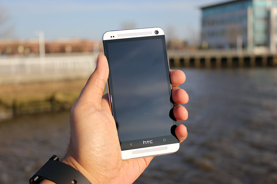
Before I get too effusive with my praise, let’s take a quick tour around the device itself. The One’s face is dominated by a 4.7-inch 1080p Super LCD3 display that’s flanked on all sides by a thin black bezel. Sitting directly above and below the display are the One’s unfortunately named Boomsound stereo speakers (a small notification LED will occasionally blink at from the top grille), and the 2-megapixel wide-angle front-facing camera rests on the top-right corner of the device’s visage.

The One’s sides and bottom are fairly nondescript — the volume rocker, microUSB port, and SIM slot are nestled along the right, bottom, and left edges respectively, while the top edge hosts a headphone jack and a sleep/wake button that doubles as an IR blaster for controlling your television.

Phew. Now that I’ve run through the laundry list, permit me to gush a bit about how the One looks.

To say that the One is understated in its design would be putting it mildly; the thing is terribly handsome in a stark, minimal sort of way. It’s worth pointing out, though, that the One isn’t actually that big a step forward from some of its predecessors when it comes to physical design. If anything, it represents the refinement of a design formula that HTC has been working on for the past 9 or 10 months with devices like the Butterfly and its American cousin the Droid DNA. Familiar elements like elongated speaker grilles, textured volume rockers, gently sloping backs, and highlighted camera pods seen in those earlier devices all make appearances on the One, but HTC has clearly upped the ante in terms of quality and construction this time around.


The first thing you notice as you pick it up is how light it is — at 143 grams it’s only a hair heavier than the Droid DNA, and (thankfully) the One’s minimal heft belies just how sturdy it feels. That’s all thanks to the device’s unibody aluminum chassis, which HTC says takes somewhere around 200 minutes for a CNC machine to carve out the One’s frame from a single block of aluminum.

That’s a considerable chunk of time for HTC to spend while some of its rivals spit out handsets like it’s nothing, but the end result is a device that feels as reassuring in your hand as HTC’s would-be savior should. That said, you still won’t want to toss the One around all willy-nilly. The white plastic polycarbonate that runs around the device is flanked on both sides by polished, chamfered aluminum edges that are prone to picking up scuffs and dings, though some people won’t care nearly as much about that as others.

Samsung could really learn a thing or two from these guys.

The One isn’t without its share of question marks, though. If you’ve used pretty much any popular Android device before spending some time with HTC One, then one little omission will probably stick out like a sore thumb. I’m talking of course about the lack of a third soft key — the company opted to stick solely with Back and Home keys separated by an HTC logo.

If you go by the company line, the choice was made in an attempt to simplify how users interact with the One. I’d actually argue that dropping that extra button is more counterintuitive than anything else since most current Android users are likely familiar with the three-button layout, but it doesn’t take too long to readjust to the two-button lifestyle.

And of course, HTC has once again seen fit to exclude a microSD card slot in its latest flagship handset. I can’t really be surprised at this point considering this is a recurring theme for HTC, and it’s not as big an issue as it was in other devices since HTC offers 32GB and 64GB versions of the One, but I’ve often looked to expandable memory as a hallmark feature of an Android device, and I’m sad to see HTC skipping them completely on its top-tier handsets.

Both versions of the One I’ve played with come loaded with Android 4.1.2, but as always, HTC has done its level best to paint over the stock UI with its custom Sense interface. The Taiwanese company has been diligently trying to trim the fat from Sense for months now with largely positive results; Sense isn’t the kludgy, overwrought beast it used to be, and Sense 5 represents HTC’s biggest leap forward to date.

Put very simply, Sense 5 looks great. Stock icons and the once-bubbly default keyboard and dialer have been designed to look flatter and less skeuomorphic, and HTC has dumped its usual font in favor of Roboto Condensed, which imbues the UI with a much cleaner vibe. The app launcher has gotten quite a facelift, too — a persistent time and weather widget lives at the top of the screen, and right out of the box you’re treated with a spacious 3×4 grid of applications. Tinkerers can easily fiddle with those particulars should they prefer a more densely packed grid like I do, and you can easily switch between ordering apps by name, recency of use, or whatever other convoluted scheme you can dream up.


Of course, some changes are more drastic than others. Take BlinkFeed for instance — in one fell swoop, HTC has decided to try and reinvent the Android homescreen. The concept is simple: the way HTC looks at it, smartphones are content-consumption devices so BlinkFeed was designed to surface content based on your interests and your social connections with as few steps as possible.

Getting Blinkfeed set up is painless enough — you can tailor your feed by selecting from some broad areas of interest (think gaming, music, politics, etc.), and by opting to receive content from your social networks, apps, and a handful of featured sources like ESPN, Vice, and Reuters (disclosure: some of Aol’s media properties are featured sources). From there, all of that stuff gets splayed out into a vaguely Flipboard-y grid for your immediate perusal, and all it takes to refresh your feed is a downward swipe.

It all makes sense on paper, but Blinkfeed in practice leaves much to be desired. Why can’t I add my own content sources? Why can’t I just turn it off rather than manually disable each content feed and switching its default homescreen status off? The likely answer to both of these questions is a familiar one: it’s all about simplicity.

BlinkFeed wasn’t necessarily designed with the power user in mind — we spoke to HTC’s Jeff Gordon just prior to the One’s launch, and he made the feature out to be a consummate time-waster, something people use when they find themselves stuck in a queue somewhere. That’s about the only time I bothered to use it to be quite honest; the rest of the time I would just fire up Flipboard or Twitter and get my content straight from the sources I wanted it from. Fortunately for me, more traditional Android homescreens are but a single swipe away, but you can only have up to four of them.

The unlocked international model doesn’t have much in the way of bloatware — just a few preloaded apps like TuneIn Radio and a Kid Mode courtesy of the folks at Zoodles — but the Sprint variant doesn’t fare quite as well. Expect oodles of carrier-loaded apps that range in quality from mildly useful (Lookout Security is nice to have around) to the nearly pointless (do we really need the Sprint Music Plus store when Google Play is right there?). Most of them can be uninstalled without much trouble at all, and those that you’re stuck with (I’m looking at you, Sprint Zone) can be easily hidden thanks to the revamped app launcher.

As you’d expect from a device that sports a cleverly-hidden IR blaster, the One also comes pre-loaded with a remote control app developed in partnership with Peel. I’ll be the first to admit that I’m no TV buff, so my experience with the remote control feature was short and sweet — the setup process was over in a matter of moments, and the One succeeded in turning my television on and changing the channel and volume a few times. After popping in my zip code and selecting my cable provider, the app also provided guide data for all the shows I don’t watch. While it’s unlikely to replace your actual remote, it works like a charm and that’s frankly a lot more than I was expecting.

With the One, HTC has officially bowed out of the megapixel race. It’s easy enough to write off the word “ultrapixel” as a spurious bit of marketing fluff, but the One’s camera manages to prove that pixel size really does make a difference.

Photos taken with the One look phenomenal when viewed on the phone’s crisp 1080p display — they’re nicely detailed and colors were vivid (perhaps a little too much so, more on that later). Sadly, a bit of that impact is lost when you transfer them to PCs or televisions. The shift towards fewer larger pixels instead of more smaller ones sounds like a good idea, and it mostly is, but there’s a sort of fuzziness apparent in some of the One’s photos that keeps my support from being full-throated. I suspect it’s an issue that won’t matter to a majority of users — the results are definitely more than adequate for [insert social network name here], and I’ve found the shots the One takes are still more pleasing than many of its competitors. If anything videos seem to fare little better; my test clips were all crisp and bright, and to my surprise the microphones blocked out plenty of background noise.

Speaking of competitors, the camera sensors in most of them struggle in low light but the One manages to dodge those issues rather nicely. It’s surprisingly good at capturing light even when it’s in short supply and manages to do so without introducing much grain into the situation. It’s worth noting that the ability for the One’s sensor to pick up as much light as it does has an impact on color reproduction. Consider the comparison shot with the iPhone 5 above — the One captures more of the scene, but some details (like the tree branches in the bottom left corner of the photo) are lost because of overexposure.


As far as the Camera app itself is concerned, it remains remarkbly clean and easy to operate. Switching between the front and rear cameras takes a single swipe, popping into Zoe mode takes a single touch, you see where I’m going. Beyond the simplistic interface though is an impressing array of settings — you can muck around with ISO, white balance, timer, scene modes, face detection, and even the review duration for recently snapped photos. Honestly, I find the idea of layering filters on top of perfectly good photos to be a little ridiculous, but the One has plenty of them for you Instagram-types to fiddle around with too.

And then there are the aforementioned Zoes, those peculiar little three second video clips that HTC has started to push with the One. When I first played with the One, I was downright dismissive of the concept. I’m still not entirely sold on them, but I’ve grown just a little more appreciative of the notion. My biggest issue with them is how you’re supposed to manage the things. It’s simple enough on the One itself — the short clips are accessible from the Gallery app and you can use the HTC Share service to post them online for 180 days, but the real problem emerges when you try to pull them off the device through USB. Zoes are locally stored as very brief video snippets but as a series of stills as well, so pulling them off the One en masse feels a bit more labor-intensive than it should.


Goodness, it seems like just yesterday that finding a 1080p display on a smartphone was a rare and wondrous event. These days nearly all the major Android players have worked those sorts of high-resolution panels into their new flagship phones — just look at the Optimus G Pro, Xperia Z, or Galaxy S4 to name a few.

Even with such notable rivals to consider, the One’s 4.7-inch Super LCD3 panel is perhaps the best smartphone display I’ve ever seen. Text and high-res images were remarkably crisp (not a surprise considering the display sports a pixel density of about 474 ppi), and the colors are bright and accurately reproduced. While some displays pump up color saturation to lurid levels and others exhibit a pale cast, the One strikes a thoughtful balance between those extremes.

I haven’t noticed any distortion or discoloration despite seeking out some of the most awkward viewing angles — in short, the One’s display is a real pleasure to ogle.

One of my biggest issues with the 5-inch 1080p panel found on the Droid DNA was that it just wasn’t all that bright compared to the competition — it was perhaps the most notable miss for an otherwise impressive display. Thankfully, HTC has addressed that issue with the One. When screen brightness is cranked all the way up on both devices, the One’s display is noticeably more luminescent than its cousin and shines on the level of devices like the Nexus 4 and the iPhone 5. It may seem like a trivial upgrade, but the weather’s getting nicer and that bump in brightness has definitely helped outdoor visibility, too.

Let’s just get it out of the way now: with a Snapdragon 600 chipset and 2GB tucked away in its handsome frame, the One was able to handle every task I threw at it with aplomb. Swiping back and forth between BlinkFeed and my more traditional homescreens were utterly seamless, as was scrolling down long webpages, and crafting ornate rococo structures in Minecraft Pocket Edition. If you’re the type that prefers numbers to anecdotes, the One’s five-run Quadrant average topped out in the low to mid 12,000s, handily blowing away devices like the Nexus 4 and the Droid DNA. Running Geekbench on the thing yielded similar results: the lowest of three trials was a 2728, which puts it on top of the performance heap again… for now anyway. It won’t be long at all before other devices start to catch up in terms of pure power, but there’s little question that the One will be able to handle nearly anything you load onto it and that’s really all that matters.

All that power comes at a cost though. The One managed to stick it out for four hours and 21 minutes of our standard battery test, in which the device is made to run through an endless cycle of Google image searches over the wireless data connection with the screen lock turned off and display brightness set to 50%. Granted, less than 4.5 hours doesn’t sound all that great, but bear in mind that’s nonstop usage — in my experience, the One always managed to make it through a full work day’s worth of checking emails, firing off text messages, playing music through the Boomsound speakers, and playing the occasional game with at least a little juice left over.

I won’t dwell too much on network performance for two reasons: your mileage will almost certainly vary from mine, and Sprint can be frustratingly sketchy in my particular corner of New Jersey. In case you were itching for a dose of Schadenfreude for the day, I was never able to pull speeds greater than 2 Mbps down and my upload speeds topped out at 3.5 Mbps — that’s not really the One’s fault but man, that really hurt. On the upside, call quality was just peachy on both version of the device I tested (you know, in case you actually wanted to use this thing as a phone).

I need to take a minute here and touch on one of the most impressive features HTC has baked into the One, and it may not be what you expected. I’ve reviewed my fair share of phones during my tenure here at TechCrunch, and with few exceptions they’ve all mostly let me down when it came to sound reproduction and quality. The One simply doesn’t — it’s got the best speakers on any smartphone I’ve ever used. Granted, that’s not really saying much since most smartphone speakers are downright wimpy, but the One’s BoomSound speakers managed to pump out crisp, loud audio along with a surprising amount of bass too. The jaunty bassline in Paul Simon’s You Can Call Me Al was bright and easily discerned, and not once during my testing did the One fall prey to the dreaded muddy audio syndrome.

I can boil the preceding 3,000 or so words into a few brief sentiments for you to chew on: the HTC One is easily the best device that the company has ever crafted, and it’s perhaps the single nicest Android phone I’ve ever used. Despite some minor faults, I haven’t so much as picked up any of the other Android smartphones scattered around my office during my time with the One unless I absolutely had to. It’s really that good.

And yet, after releasing a smartphone to near-universal acclaim, HTC’s future is still unclear. As Matt pointed out a little while back, building the perfect phone just isn’t enough anymore. These days it seems like technical expertise and the achievements that stem from them can often be overshadowed by lavish ad campaigns and the ability to churn out devices at a breakneck pace. That said, the mobile industry has never really been what you could consider meritocratic — the market is fast and unforgiving, and there aren’t many companies that have learned that lesson as clearly as HTC has.

There’s no question that the One will be facing some very serious competition in short order, but if you’re looking to pick up a new phone in the weeks or months to come it’s definitely worth your consideration. Trust me, you’ll find plenty to like here.

The BlackBerry Q10 Is A QWERTY Keyboard Smartphone Comeback Worth Waiting For

blackberryq10

The BlackBerry Q10 is, some might say, the BlackBerry OS 10 device that the company should have led with, ahead of its all-touch Z10. That’s because it sports a hardware QWERTY keyboard, something that has become a unique distinction among top-tier smartphones these days. BlackBerry tells me they wanted to nail the all-touch experience first, in part to prove that they could, but based on my last few days with the Q10, this is the phone that’s more deserving of the “flagship” moniker for the new BlackBerry fleet.

  • 3.1-inch, 720×720, 330 PPI display
  • 2GB RAM
  • 16GB storage, expandable via microSD (supports up to 32GB cards)
  • Dual core 1.5GHz processor
  • 8 megapixel, 1080p rear camera; 2 megapixel, 720p front camera
  • microHDMI out
  • Dual-band 802.11 a/b/g/n Wi-Fi
  • LTE or HSPA+, global roaming cellular connectivity
  • MSRP: Likely around $199 on a 2-year agreement

Pros:

  • Solid industrial design
  • Good battery life
  • Hardware keyboard means business

Cons:

  • App ecosystem still way behind
  • Display visibility suffers in bright light
  • Screen and bezel size hamper gestures

The BlackBerry Q10 is proof that a handset can take cues from the past and still be a modern, attractive device. The PVD-coateed metal border that frames the phone won’t scratch easily, as it’s the same treatment used on high-end watches. The carbon/glass composite back is extremely light, yet flexible and strong enough to handle spills, and since it’s created using a process through which it’s cut from a giant sheet and then formed instead of injection moulded, no two backs will have exactly the same pattern. It’s lighter and smaller than the Z10, feels better in the hand and looks miles better, too.


BlackBerry hasn’t reinvented the wheel with the Q10; you might have already seen one in the wild and mistaken it for a Bold, in fact. But the small changes pay big dividends. Straightening the top row of the keyboard and dropping the trackpad and hardware buttons provided room for a display that’s 30 percent larger than any previous BlackBerry QWERTY, for example, and yet typing actually feels better because of wider keys and bigger frets between the rows.

My complaints when it comes to hardware design are limited, but the back panel has a bit of play, and will shift around a bit even when it’s supposed to be firmly clicked into place. It’s a little disconcerting given the overall fit and finish, but also doesn’t reveal itself awesome enough to be anything more than a minor annoyance.

The BlackBerry Q10′s display is unique among modern smartphones in that it isn’t gigantic. Quite the opposite, in fact: at 3.1-inches, it’s the smallest screen of any flagship-priced device currently available on the market. Yet it’s also 30 percent larger than any of its QWERTY BlackBerry predecessors. And it’s a SuperAMOLED display, which translates to very nice color rendering, deep blacks, and good battery conservation.

Overall, the display really impresses. It displays images and video with crisp, vibrant colors, and BlackBerry has even gone out of its way to tweak some user interface and core app elements to take advantage of the excellent black rendering, which also leads to battery life savings. But the display has its own downsides, too. It isn’t quite as densely packed with pixels as some of its top-tier Android competitors, for instance, and I noticed that in certain outdoor lighting conditions, owing partly to glare and partly to a weak backlight (which doesn’t auto-adjust), it can be fairly hard to make out what’s on the screen. Side-by-side with an iPhone in bright outdoor settings, the iPhone wins easily, every time.

That said, the display is usable outside, and works surprisingly well for viewing photos indoors. Text rendering isn’t quite as nice on the Q10 as on Z10, but I also didn’t notice the same problems with surface grime accumulation that affected my Z10 review unit, so there might be a better oleophobic coating on this one.

The Q10 is largely the same in terms of built-in software as the Z10, so I won’t go into as much detail about every single feature of BlackBerry OS 10 (check out my Z10 review for more on that). But it is worth highlighting the changes BlackBerry has made that take advantage of the Q10′s hardware keyboard, and also the trade-offs that sometimes result from those changes.

The home screen arrangement has been tweaked slightly to make room for three rows of apps, and the toolbar size has been reduced as well as labels have been removed. There are new tooltips, which is great because it provides a smoother onboarding process for BB10. Text selection is made easier through refined cursor control, making it much less frustrating than it was on the Z10. Cut, copy and paste functions have been added to the dialer screen, and you can set account-specific notifications for incoming messages  as well as change vibration and volume patterns for alerts for specific contacts.

Overall, BlackBerry has done a good job of taking in early user feedback and using it to actually improve BB10 in the areas where it was most lacking. The Q10 boasts BlackBerry OS 10.1, an update which will make its way to the Z10 within the coming weeks, bringing the same improvements over to that side of the fence, including the improvements above and crucial bug fixes for issues like the lack of calendar syncing for Outlook users. But the really impressive software features of the Q10 focus on the keyboard.

The Q10 keyboard is always present, so it makes sense to make use of it whenever possible. BlackBerry has done this by introducing Instant Action, which allows you to start typing and then execute a variety of commands, in a variety of apps. there’s a huge list of keyboard shortcuts, but some highlights include being able to BBM contacts, Tweet, send emails and more all without opening the relevant app, from no matter where you are in the OS. It’s a remarkable time saver, and a good example of why the hardware keyboard still has something to offer in a world dominated by touchscreen displays.


In general, software is improved, but since the Q10 uses the same touch-based gesture control as the Z10, but features a smaller bezel, it can be harder to execute Peek actions, or to navigate around the OS. Some improved sensitivity on the software side here would’ve helped the Q10′s software performance.

The Q10′s camera is the same as the one found in the Z10, and as expected, performs in a very similar fashion. The big addition here is on the software side, since the Q10 with BlackBerry 10.1 now offers HDR. This is a feature that most OEMs have embraced lately, and also something I never find myself using on any mobile device. I’m also not a huge fan of it when used professionally by DSLR photographers. The addition isn’t hurting anything though, and will be welcome by those that appreciate it.


Overall, the Q10′s camera is a solid performer. It won’t win any low-light awards, and that’s putting it lightly, but it can still manage to take some amazing shots, which look even more amazing with the slightly exaggerated color rendering of the OLED display. It also captures stills in 1:1 ratio by default to match the display, though you can set it to use either 16:9 or 4:3, too. Video is perfectly usable, too, and defaults to wide-screen capture.

This is the one place where the Q10 doesn’t fare that much better than its counterpart the Z10. Despite the fact that BlackBerry has made a lot of noise about growing its own app marketplace to 100,000 titles, there still aren’t too many to write home about. Some big names have come on board, but crucial ones, like Netflix, Instagram and Vine, to name just a few, remain absent.

The Q10′s app situation isn’t helped by the fact that it has such a unique screen size. The screen means that native BB10 apps have to be coded specifically to offer both Z10 and Q10 compatibility, which BlackBerry assures me is simple enough, but which still inevitably results in some fragmentation. Q10 users simply won’t see apps that aren’t designed for its display – unless they’re Android apps. Android ports still show up and can be downloaded and used.

That’s a double-edged sword, however. I found performance to be unpredictable with Android ports; Songza, for instance, lacked its concierge feature when running on the Q10. Others had bizarre visual element distortions, and even when everything goes smoothly, it still requires scrolling through an interface designed to be viewed all at once.

The Q10′s app situation is a reminder just how far BlackBerry has to go, and a signal that it will probably have a much more targeted audience than the general purpose Z10.

Where the Z10 faltered with battery, the Q10 excels. BlackBerry claims that the Q10 can get up to 13.5 hours of 3G talk time, 354 hours standby time, 61 hours of audio playback or up to 9 hours of video. In testing video playback and solid browsing time, it managed to come just shy of that at around 8 hours continuous use, but the standby time is what’s really impressive. This phone sips power with the screen off when it’s in your pocket, harkening back to BlackBerrys of old. It isn’t quite as long-lived, but it’s still impressive for a modern smartphone.

In actual usage, being neither extremely conservative or extremely power-hungry, the Q10 manages nearly two days of use in my testing, which is, again, very unusual for a smartphone. It boasts a larger 2100 mAh battery, compared to the Z10′s 1800 mAh unit. That means you can’t use the Z10′s external charger accessory to juice up the Q10′s battery, but BlackBerry offers the exact same device designed for the new phone’s battery, too.

The BlackBerry Q10 is unique among smartphones, with its square display and hardware keyboard. And BlackBerry knows that it will appeal to a certain kind of consumer. What I found in using it, is that I actually gravitated towards tasks that were productive – zapping my inbox overload, typing up actual complete paragraphs for longer posts (I’ve never used another smartphone to do that), using the newly-ported Skype app to stay in touch with teammates. This is a business phone, and an unabashed one, and in a world where we often want our devices to do everything for us, a little focus is actually a very refreshing thing.

That said, evaluate your priorities if you’re thinking about getting a Q10: the app situation is still dismal for BlackBerry 10, despite progress made since the official launch at the end of January. And the OS software itself still has some bugs, too: I experienced one black screen freeze that required a soft restart, and one issue where my cellular signal continually dropped until I turned cell traffic off and then on again. For those reasons, I still have trouble recommending it generally over the iPhone or a top-tier Android phone, if only because of the ecosystem that now surrounds those devices. But if you’re a BlackBerry lover, or if you long for the days when you could feel that keyboard under your fingers, the Q10 is very impressive device, especially from a company that more than a few people had completely counted out completely.

The Q10 arrives in Canada and the U.K. first, beginning in early May (May 1st in Canada), with an expected rollout in the U.S. towards the end of May in the U.S. It’ll cost $199 on contract at Canadian carriers on a three-year agreement, and will run for $249 on a 2-year agreement in the U.S. That’s relatively steep, especially for a phone with 16GB of onboard storage, but I expect we’ll see discounts and special offers before too long, as we did with the Z10.

The BeagleBone Black Is A New Single-Board Computer That Can Brew Beer

beaglebone-specs-640x444

While the Raspberry Pi is great for educating kids about computing, can it brew a mean beer? The BeagleBone Black can. Trevor Hubbard, an engineer at Texas Instruments, uses the new, next-gen board to control heat exchangers and monitors to handle beer temperature remotely.

The board itself is quite cool. It runs a AM335x 1GHz ARM Cortex-A8 processor with graphics accelerator and has two 46-pin headers for IO, making it ideal for monitoring and robotics. The board itself costs $45 and is available now.

It can run Android and Ubuntu linux and connects to the Internet via Ethernet or a USB Wi-Fi dongle. Interestingly, the entire board is open source, allowing you to download and tweak the design to suit your needs.

The company was founded by Jason Kridner and Gerald Coley, two TI engineers. The headers allow for multiple styles of input and output including serial connectivity, timers, and digital I/O. While not as inherently simple as the Raspberry Pi, it’s still a formidable board.

Hubbard, who recorded a video about his project, shows how he can control his beer temperature remotely using a BeagleBoard, the Internet, and a taste for bubbly hops. There is, I’d wager, not much more a man could ask for.

via Ars

Apple CEO Tim Cook Hypes The Fall, Downplays The Summer On New Hardware

Image (1) iwatch_def11.jpg for post 157418

Apple CEO Tim Cook doesn’t generally talk too specifically about upcoming product plans, but he went out of his way to put an unusually fine point on when to expect new products than he usually does. Cook kicked off today’s Apple earnings call talking about how Apple is looking forward to exciting product news in the fall, and throughout 2014, and then reiterated the exact same thing during the Q&A period.

“I don’t want to be more specific, but we’ve got some really great stuff coming in the fall and across all of 2014,” Cook said later when asked if he could expand upon his earlier statements. Clearly, he didn’t expand, but he firmly reiterated what he’d said earlier. It seemed pretty apparent that Cook intended to manage expectations relative to Apple’s product release cycle in a much more direct way than Apple has in the past.

The statement on the surface seems designed to cool rumors and speculation that we’ll see a new iPhone (or perhaps multiple new models) at or around Apple’s upcoming WWDC 2013 event. Reports sourced from Apple’s supply and manufacturing partners have suggested a ramp-up in preparation for a June-ish consumer release, although just this past week some analyst chatter began to suggest that the iPhone 5S specifically might get pushed back to a (*gasp*) fall release.

Cook also wouldn’t go so far as to eliminate entirely the possibility that we’ll see new products before the fall, but he clearly wanted to put the spotlight on later this year and the entirety of next year in terms of product innovation. Whether that means we’ll only see modest changes before September, with big bombshells like the rumored iWatch sometime later, or whether we won’t see anything before autumn, remains to be seen.

Apple almost never spills any beans about what its product plans are, so it’s worth getting excited about fall based on Tim’s willingness to talk about that specific period, as well as his mention of “new product categories.” Still, unless he’s purposefully trying to throw us off the scent, people eager for new Apple products might also want to sleep through the summer.

Apple Sells 37.4M iPhones And 19.5M iPads In Q2, Tablet Business Shows 65% YOY Growth

iphone5

Apple has just released its Q2 2013 earnings report, announcing sales of 37.4 million iPhones in the quarter ending March. Apple also reported 19.5 million iPad units sold, which shows incredibly strong growth for Apple’s tablet business.

This is a slight decrease from last quarter, which included a holiday sales spike and being the first full quarter in which the iPhone 5 was available.

In terms of iPhones, this quarter’s 37.4 million represents 7 percent YOY growth; however it’s down 22 percent from last quarter. Where iPads are concerned, we’re seeing an 18 percent decline from last quarter, yet the segment remains strong. It’s grown 65 percent from last year’s 11.8 million from the same quarter.

Moreover, this is the iPad’s second-best quarter ever, losing out only to last quarter. It’s also the best non-holiday quarter the iPad has ever seen.

The iPhone numbers here aren’t all that surprising. Tim Cook has said before (and Steve Jobs before him) that expectations for the next-gen iPhone always tend to slow sales of the current model ahead of launch. Since we expect to see the next iPhone in June, it would make sense for sales to slow a bit.

Last quarter, Apple sold a whopping 47.8 million iPhones and 22.9 million iPads, both of which broke previous records. In other words, this latest report shows continued growth for the iDevice segment.

Apple doesn’t break out specific device numbers, so it’s hard to tell which models perform best. However, it seems that the introduction of the iPad mini has most certainly boosted sales for Apple’s tablet division, as many have been holding out for a smaller tablet from Apple since the iPad first launched.

Infinity Cell Lets You Charge Your iPhone Simply By Shaking It

Infinity_Cell_smartphone_Kinetic_Charger_1

The Infinity Cell is a kinetic charger for the iPhone that uses your body’s movement to generate electricity. The current prototype for the Infinity Cell is a crude 3D printed rectangle, roughly the size of a pack of cigarettes, linked up to the iPhone with a cable. The plan is to create a more streamlined version during the product’s Kickstarter campaign.

When you shake the Infinity Cell for 30 minutes, that provides enough power to give the iPhone a 20 percent charge. When you shake the Infinity Cell for three hours, that provides enough power to fully charge the iPhone. Of course, no sane person is going to sit around shaking his iPhone for three hours to grab a charge. The Infinity Cell eventually aims to generate power from the slightest bit of movement.

The finished model will resemble a Mophie or MaxBoost battery case. You simply slip your iPhone into the case, put in your pocket, and the movement you create when you’re walking, jogging, or biking will power your iPhone. They’re also planning on releasing an Infinity Cell iOS app that will track your energy saving, carbon offset, and gamify the experience by granting users badges as they reach different energy saving rankings.

The creators of Infinity Cell are seeking to raise $155,000 on Kickstarter by June 6th. A $125 contribution will nab you an Infinity Cell of your own, although it’s only compatible with iPhone 4 and 4S for now.